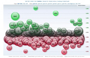
Nobody likes it when the markets takes a tumble like yesterday (Except the bears of course) But among the weakness, you can easily spot the stronger stocks and focus your long position.
The bubble map from finviz.com below shows clearly which stocks in the S&P 500 have relative strength. Some of these stocks moved up substantially and I have been covering their action in this blog like Bank of America (BAC), US Steel (X) and Celgene (CELG) among many others. The chart also confirms that financials and basic material stocks continue to show strong momentum going into 2014. I’ll be keeping an eye out on these green bubbles this year.
-
Archives
- January 2018
- December 2017
- November 2017
- October 2017
- September 2017
- August 2017
- July 2017
- June 2017
- May 2017
- April 2017
- March 2017
- February 2017
- January 2017
- December 2016
- November 2016
- October 2016
- September 2016
- August 2016
- July 2016
- June 2014
- April 2014
- March 2014
- February 2014
- January 2014
- December 2013
- November 2013
- October 2013
- January 2012
- December 2011
- November 2011
- September 2011
- August 2011
- July 2011
- June 2011
- May 2011
- February 2011
- January 2011
- December 2010
- October 2010
- September 2010
- August 2010
- July 2010
- June 2010
- May 2010
- April 2010
- March 2010
- February 2010
- January 2010
- December 2009
- November 2009
-
Meta

